
Kaafila
Outdoor gear brand for trekkers and weekend hikers
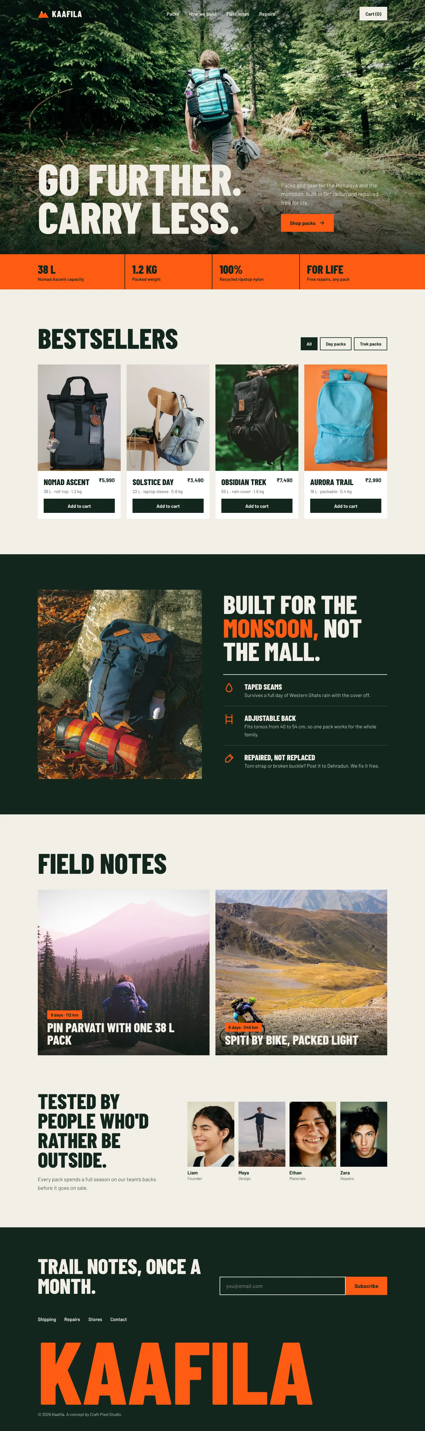
A landing page for packs built for Himalayan treks and monsoon commutes. The buyer compares specs, so the page has to be loud and specific at the same time.
- Product
- Outdoor gear brand
- Made for
- Trekkers and weekend hikers
- Typefaces
- Barlow Condensed + Barlow
- What it is
- Studio concept, not client work
What the page has to do
Every section answers a question the visitor has at that point in the scroll. In order:
- 01 Hero
- 02 Spec bar
- 03 Bestsellers
- 04 How it's built
- 05 Field notes
- 06 The team
- 07 Newsletter
- 1
Specs as a headline
An orange spec bar under the hero gives 38 L, 1.2 kg and repairs for life the same weight as the slogan.
- 2
Shop from the first scroll
Bestsellers with prices, weight and Add to cart come straight after the hero, filtered by day or trek packs.
- 3
Real trips as content
Field notes and the team testing gear make the brand feel used outdoors, not shot in a studio.
On a phone at 390px
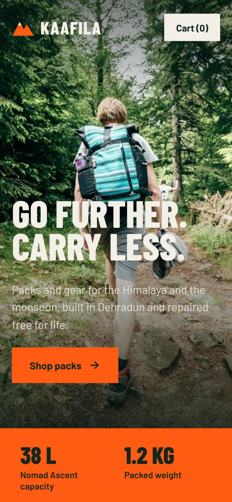
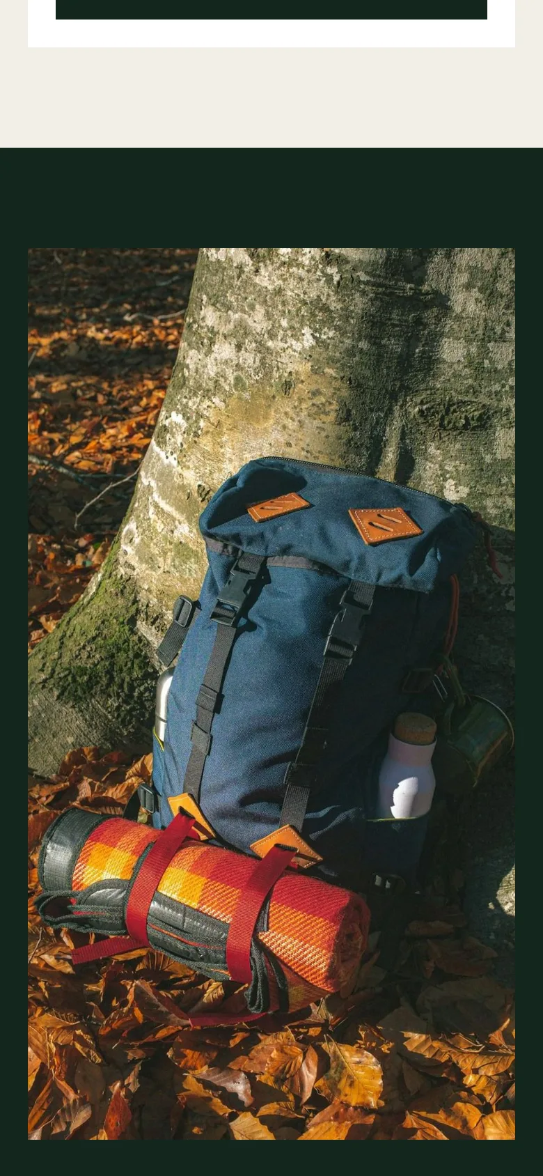
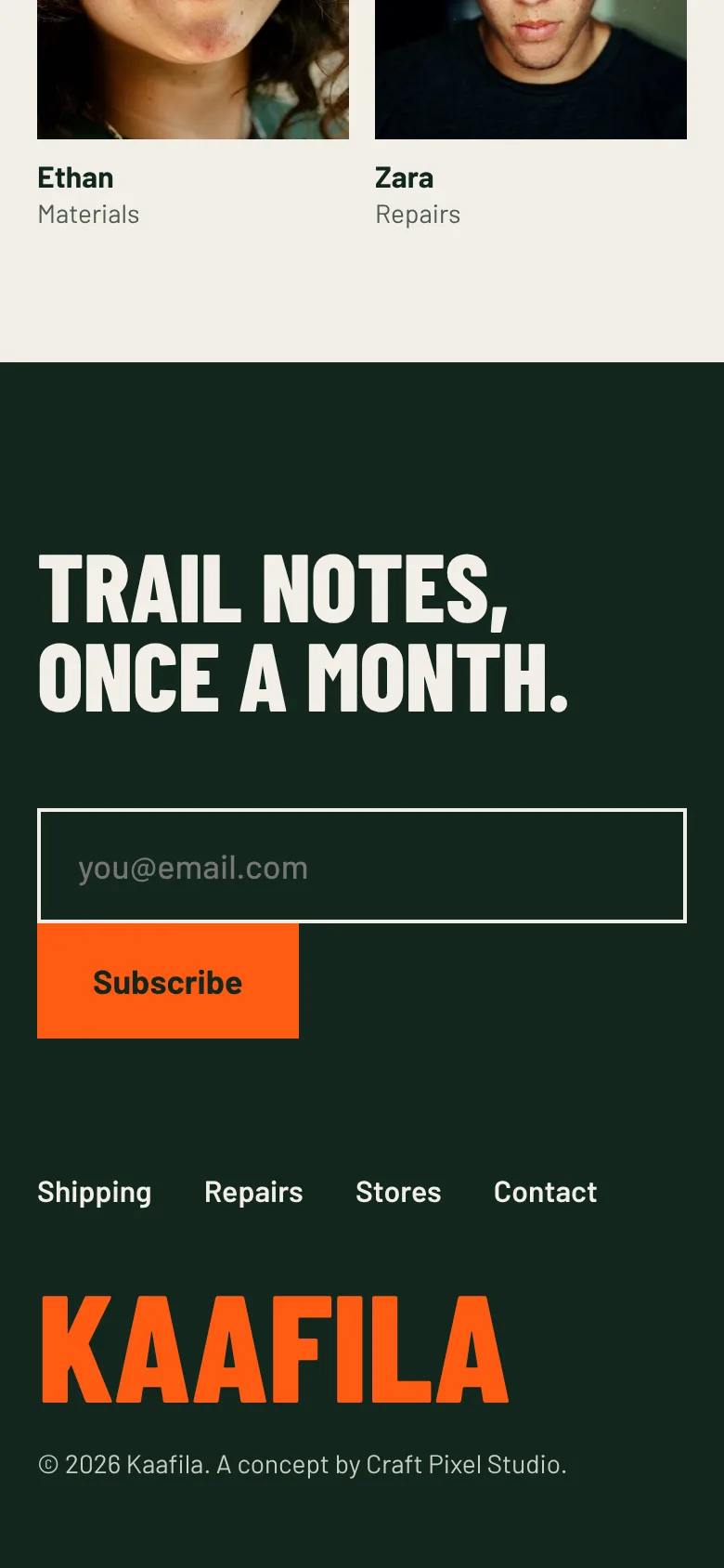
Rebuilt for the thumb, not shrunk: single columns, full-width buttons and tap targets of at least 44px.
Type and colour, chosen for the reader
Typefaces
- Headlines
- Barlow Condensed
- Body and interface
- Barlow
Condensed caps read like the labels stitched onto gear and fit big numbers into narrow spec cells. Plain Barlow keeps the body in the same family, so the page stays one voice.
Palette
- Forest#12261C
- Blaze orange#FF5B14
- Canvas#F2EFE6
- Moss#4D5A52
- Lichen#C9CFC4
Kaafila is a studio concept: a landing page we first designed in Figma, redesigned with a new name, logo and copy to show the level of UI we build. It is not a client project.